We’ve come a long way since our founding. Our previous brand no longer fits our capabilities or our future ambitions. To better align our brand experience with the direction our agency is headed, a full rebrand was necessary.
Since our inception, we’ve always been a hardworking, knowledgeable technical development agency. We’re now more than that. We’ve brought design services in-house, our development team is continuously growing in number and expertise, and our product offering is more robust than it’s ever been. The culmination of this growth resulted in the need for a brand that better represents who we are, what we do, and why we do it.
Generally speaking, we wanted a brand that exuded more fun and excitement while also being professional. So, after reviewing our previous brand materials and a brand assessment by our leadership team, we dialed in on five key attributes we wanted our brand to be: Dynamic, Smart, Friendly, Vibrant, and Clean.
For inspiration, we looked at branding from all over, across all types of media. Making sure to look at other creative digital agencies; how they expressed their brand on their website, on social media, and in their marketing materials. We used all of this inspiration as a reference as we crafted our new brand’s look and feel.
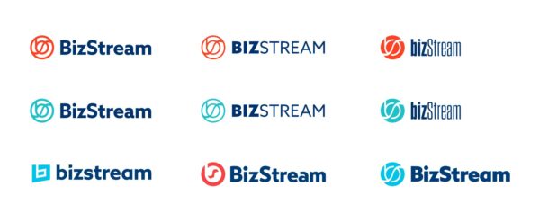
Our previous logo’s heart was in the right place, but the execution wasn’t right for us anymore. For example, we liked the idea of the “B” and “S” combo in the icon, but the previous icon was visually busy, and the thin negative spaces didn’t reproduce well at small sizes.
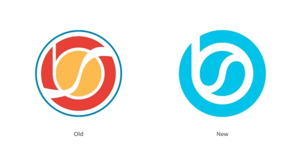
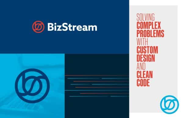
As we reworked the icon, we came upon a happy accident of a yin-yang shape in the middle, which was a fitting visual expression of our new design + development service offering.
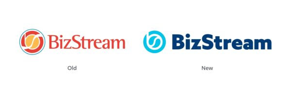
The font used in the previous wordmark was too thin when paired with the icon, and the serifs didn’t fit stylistically very well. The weight of the new wordmark balances much better with the new icon, is much cleaner, and is more aesthetically aligned with our brand attributes.
Our previous color palette used shades of the primary colors (red, yellow, and blue), which did not give our brand much uniqueness or individual style. In addition, during our review of the previous brand, we determined that almost all of the colors from the palette were used on every individual marketing item. This hurt the information hierarchy and made many of the items more visually complex than necessary.
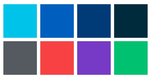
The new color palette has more focus on creating a unique look and feel with color. Plus, it has a greater range of values to make more dynamic compositions. As well as vibrant secondary colors that can help add visual flair when needed.
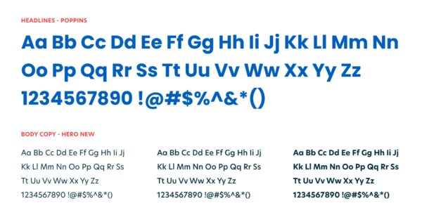
The fonts used with our previous brand felt too industrial and clunky, especially when used in large headlines. The lines and curves of our new fonts have a more casual and friendly feel. Our new fonts also have a wider range of weights which allow for more design flexibility when creating branded items.
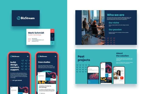
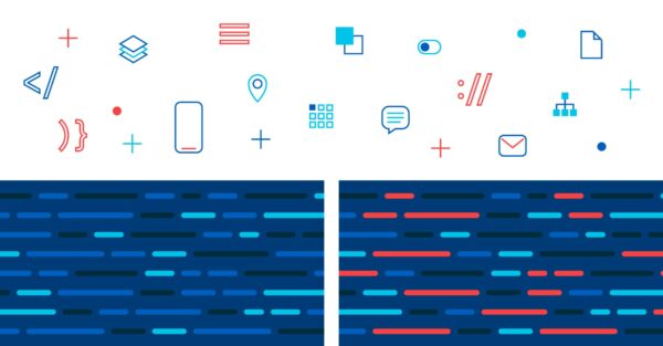
The last essential item needed for the rebrand was the development of graphic elements. Graphic elements are visual items or treatments that tie the brand together across various media. Similar to the logo, but much more varied, they create a visual connection from one brand experience to the next. Common graphic elements include: icons, illustrations, patterns, specific image cropping, etc.
Redesigning every aspect of our brand helps visually establish the next chapter of our agency. We could have updated just some aspects of the brand and marketing materials, but it wouldn’t have felt right for what we wanted to do. We want current and future clients to get a better feel for who we are and what we do simply by being exposed to our brand. A full rebrand was the only way to achieve that goal. We’re the same great digital partner we’ve always been, now with an updated look and a wider service offering.
Not only did we design and implement our own rebrand. We also do this for our clients! If you’d like us to help with your rebrand project, contact us.

We love to make cool things with cool people. Have a project you’d like to collaborate on? Let’s chat!
Stay up to date on what BizStream is doing and keep in the loop on the latest in marketing & technology.