In this post, we will explore creating custom form components for Page Builder widgets. We will create an Icon Selector form control allowing content administrators to pull icons from a selected font.
This solution is based on a Kentico 13 Xperience website using MVC and ASP.NET Core.
Building Page Builder widgets is about creating reusable components for content administrators to create beautiful pages. Once you have your requirements for the widget, you can begin writing the solution. In our case, we need to create a button that will support the following items:
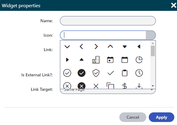
With the above requirements, something jumps out with two of them – styles for the button as well as the inclusion of an icon. In order to tackle that problem, we need a form control for the widget so content administrators can choose which icon they want to use.
The desired outcome will be a text box with a button. When the textbox receives focus or the button is clicked, a container that looks similar to a drop-down will appear with the icons showing. Clicking an icon will select one, filling in the textbox with the CSS class of the icon.
To create the Page Builder Form Component, we will need to make the following files:
We will be placing these files in our Web project since Page Builder is driven by the website’s frontend.
In the Web project, we will start with the class file. I created the following file:
Web/{yourViewPath}/IconSelector/IconSelectorFormComponent.cs
The first thing to be done is to register the component. Add the following line above the namespace:
					[assembly: RegisterFormComponent(
    IconSelectorFormComponent.IDENTIFIER,
    typeof(IconSelectorFormComponent),
    "Icon Selector Form Component",
    ViewName = "~/{yourViewPath}/IconSelector/_IconSelectorFormComponent.cshtml")]
Next, you will want the IconSelectorFormComponent to inherit from the TextInputComponent, allowing us to extend the built-in Kentico component.
Then, you will create a new public constant to support the component registration we did above.
So far, your class file should look something like this:
					[assembly: RegisterFormComponent(
    IconSelectorFormComponent.IDENTIFIER,
    typeof(IconSelectorFormComponent),
    "Icon Selector Form Component",
    ViewName = "~/{yourViewPath}/IconSelector/_IconSelectorFormComponent.cshtml")]

namespace Web.{YourViewNamespace}.IconSelector
{
    public class IconSelectorFormComponent : TextInputComponent
    {
        public new const string IDENTIFIER = "IconSelectorFormComponent";
    }
}
We still need to create a few things to tie the classes together for the icon font. To do that, we need to download the font we want to use and create a class with the CSS font classes as string values.
Once you have an icon font, you can assemble the class file.
Web/Models/Configuration/IconFont.cs
The class variables are strings named to match the keys of our key-value pairs in the JSON file to deserialize properly. A snippet of the class:
					public class IconFont
    {
        public const string ArrowAngleDown = "icon-arrow-angle-down";
        public const string ArrowAngleLeft = "icon-arrow-angle-left";
        public const string ArrowAngleRight = "icon-arrow-angle-right";
        public const string ArrowAngleUp = "icon-arrow-angle-up";
        public const string ArrowDown = "icon-arrow-down";
        public const string ArrowLeft = "icon-arrow-left";
        public const string ArrowRight = "icon-arrow-right";
        public const string ArrowUp = "icon-arrow-up";
        public const string Building = "icon-building";
        public const string CalendarDate = "icon-calendar-date";
        public const string Calendar = "icon-calendar";
        public const string ChartPie = "icon-chart-pie";
}
Let’s jump back over to IconSelectorFormComponent.cs and finish off the class. We will declare a new method called GetIconClasses(). This method will read the class through Reflection and use LINQ to return an IEnumerable<string> of our CSS classes.
					public IEnumerable<string> GetIconClasses<T>()
{
        return typeof(T).GetFields(BindingFlags.Public | BindingFlags.Static | BindingFlags.FlattenHierarchy)
               .Where(field => field.IsLiteral && !field.IsInitOnly && field.FieldType == typeof(string))
               .Select(field => field.GetValue(null).ToString());
}
At this point, we are ready to create the view for the form component. In the Web project, I created the following file:
Web/{yourViewPath}/IconSelector/_IconSelectorFormComponent.cshtml
First, we will want to do a couple of imports as well as identify the model:
					@using Kentico.Forms.Web.Mvc;
@using Web.{YourViewNamespace}.IconSelector;
@model IconSelectorFormComponent
One thing to keep in mind when developing form controls for Page Builder is that there are likely to be multiple widgets on a page at the same time. To make this work correctly, we will use Razor to create a unique identifier for each control on the page.
We also need to give our input a class to support the JavaScript we will write to handle our events. To do that, we first have to remove the class attribute since the property is read-only, but we must also maintain the original classes.
Next up is the presentation, where we will declare an input, a button for the input, and a drop-down of buttons for selecting the icon visually. The drop-down will be hidden by default, and we will show and hide it with events in the JavaScript we will write after the presentation markup.
					@{
    var uniqueId = $"icon-selector-{Guid.NewGuid().ToString()}";

    // set up attributes and adjust class on the Icon input
    var htmlAttributes = ViewData.Kentico().GetEditorHtmlAttributes();

    if (htmlAttributes.TryGetValue("class", out var objHtmlAttributesClasses))
    {
        var htmlAttributesClasses = Convert.ToString(objHtmlAttributesClasses);
        if (!string.IsNullOrEmpty(htmlAttributesClasses))
        {
            htmlAttributes.Remove("class");
            htmlAttributes.Add("class", $"selected-icon {htmlAttributesClasses}");
        }
    }
}
					<div id="@uniqueId" class="icon-selector-container">
    @Html.TextBoxFor(x => x.Value, htmlAttributes)
    <button type="button" class="icon-selector-input-button no-style">
        <span class="icon-selector-button-selected-icon @Model.Value"></span>
    </button>
    <div class="icon-popup-selector" style="display: none;">
        @foreach (var option in Model.GetIconClasses<IconFont>().ToList())
        {
            <button type="button" class="btn btn-default dropdown-toggle icon-only">
                <span class="@option" title="@option" aria-hidden="true"></span>
            </button>
        }
    </div>
</div>
We need to include the JavaScript in the markup file because we need to use the GUID that we created so we get the correct elements when there are multiple instances on the same page.
We will add click events for the buttons and a focus and blur event for a better user experience.
					<script>
    (function() {
        const widget = document.getElementById('@uniqueId');
        const selectedIcon = widget.getElementsByClassName("selected-icon")[0];
        const iconsDdlButtons = widget.getElementsByClassName("icon-popup-selector")[0].getElementsByTagName("button");
        const popupIconSelector = widget.getElementsByClassName("icon-popup-selector")[0];
        const selectedIconButton = widget.getElementsByClassName("icon-selector-input-button")[0];
        const selectedIconButtonIcon = widget.getElementsByClassName("icon-selector-button-selected-icon")[0];

        Array.from(iconsDdlButtons).forEach(button => button.addEventListener("mousedown", (event) => {
            const iconClass = event.currentTarget.querySelector("span").getAttribute("class");
            selectedIcon.value = iconClass;
            selectedIconButtonIcon.className = iconClass;
        }))

        selectedIcon.addEventListener("focus", () => {
            popupIconSelector.style.display = "block";
        })

        selectedIcon.addEventListener("blur", () => {
            popupIconSelector.style.display = "none";
        })

        selectedIconButton.addEventListener("click", (event) => {
            selectedIcon.focus();
        });
    })();
</script>
Finally, we can wrap things up by styling the form component. We want the input to match the rest of the form and the drop-down to look nice and hover absolutely positioned underneath the input.
You can get creative with your classes or be a bit heavy-handed with some important declarations on some styles. For the sake of this tutorial, I went the heavy-handed route, as the main focus is the functionality above, and these styles will only be used for this particular use case.
Note – we aren’t covering this topic in this tutorial, but I am using Tailwind CSS for styling to keep things simple.
					.icon-selector-container {
  @apply h-8 !important;
  @apply leading-5 !important;
  @apply max-w-xs !important;
  @apply relative !important;
}

.icon-selector-input-button {
  @apply absolute !important;
  @apply border-solid !important;
  @apply bottom-0 !important;
  @apply flex;
  @apply items-center !important;
  @apply justify-center !important;
  @apply rounded-br-2xl !important;
  @apply rounded-tr-2xl !important;
  @apply right-0 !important;
  @apply top-0 !important;
  @apply w-8 !important;

  background-color: #c2c7cf !important;
  border-color: #a1a9b6 !important;
  border-width: 2px 2px 2px 0;

  & > span {
    font-size: 1.25rem !important;
  }
}

.icon-popup-selector {
  @apply absolute !important;
  @apply border-2;
  @apply border-solid !important;
  @apply hidden;
  @apply left-0 !important;
  @apply max-h-40 !important;
  @apply overflow-auto !important;
  @apply right-0 !important;
  @apply top-full !important;

  background-color: white !important;
  border-color: #a1a9b6 !important;
  z-index: 99999 !important;

  & button {
    @apply m-1;
    @apply h-9;
  }

  & button > span {
    @apply p-1;

    font-size: 1.75rem;
  }
}

.icon-popup-selector > button:hover  {
  @apply bg-gray-200;

  border-radius: 3px;
}

.selected-icon {
  border-bottom-right-radius: 0;
  border-right-width: 0;
  border-top-right-radius: 0;
  width: 300px;
}
In conclusion, the custom form component created in this tutorial offers a wealth of benefits for content editors working with Kentico 13. Developing the ability to add custom icons and easily reuse the component in future widgets, creates a powerful tool for enhancing the flexibility and functionality of page builder widgets. With this component, content editors can work more efficiently and with greater ease, resulting in an improved overall user experience for website visitors. Extending Kentico in this way, demonstrates the platform’s robust capabilities for customization and adaptation to specific business needs.

Stay up to date on what BizStream is doing and keep in the loop on the latest in marketing & technology.