There are many important things to consider when designing your website for use on a smaller mobile device. Not thinking through the user flows or organization of content on these smaller devices can add unintended or unnecessary barriers to your customers reaching the information they are looking for.
Here are six of the top items to think through in order to design an optimal mobile user experience.
Simple navigation offers a clear and intuitive way to transition between screens and locate desired content. Make sure the most important sections of your site are visible with one click of the mobile menu.
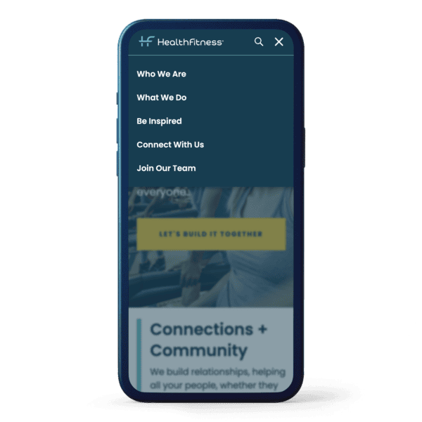
See our work for HealthFitness
Ensure that the controls in your design are large enough to facilitate easy thumb and finger tapping. Using larger controls will prevent user frustration while interacting with your website on a small device. Make sure to test on actual devices to ensure ease of use.
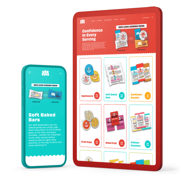
See our work for Zee Zees
Avoid overloading the interface with excessive information. Arrange your content in a manner that presents users with a clear understanding of available features. Minimize clutter and display only essential content on the screen.
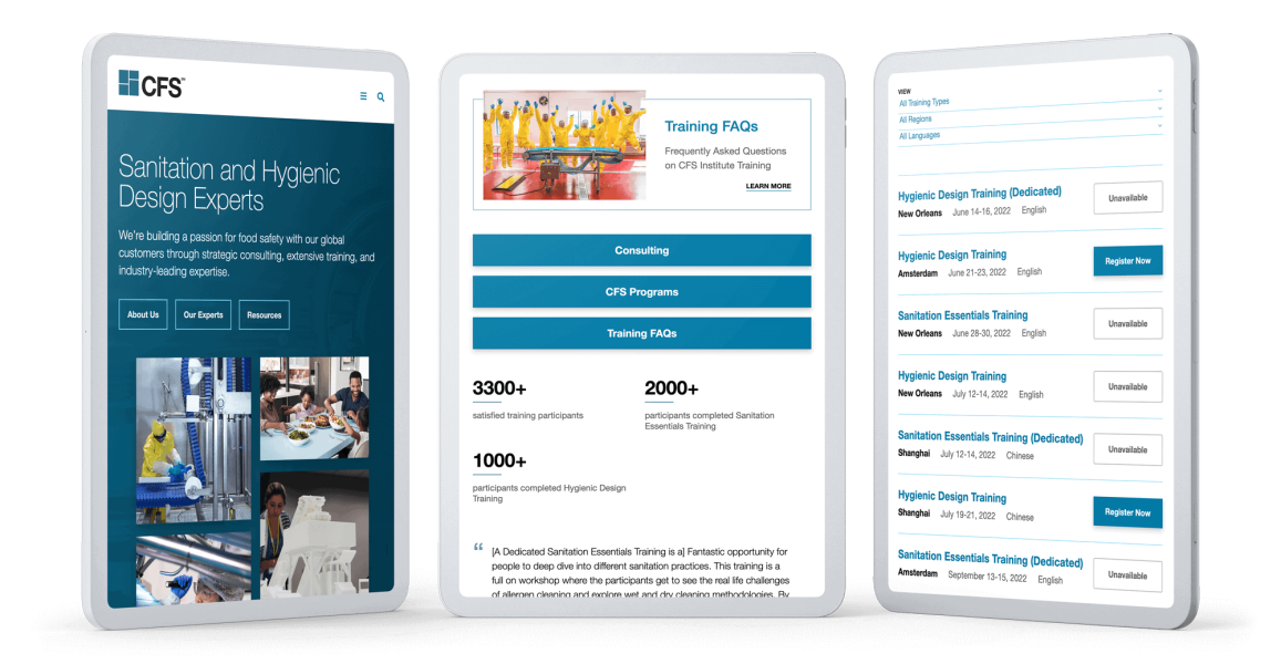
View our work for Commercial Food Sanitation
Most modern mobile devices have a high-resolution screen. So, even though the screen is physically smaller, the pixel resolution can be the same, or sometimes higher, than some desktop or laptop monitors. Make sure the images served to mobile devices have been scaled to look their best on mobile devices while also optimized to not hinder page load.
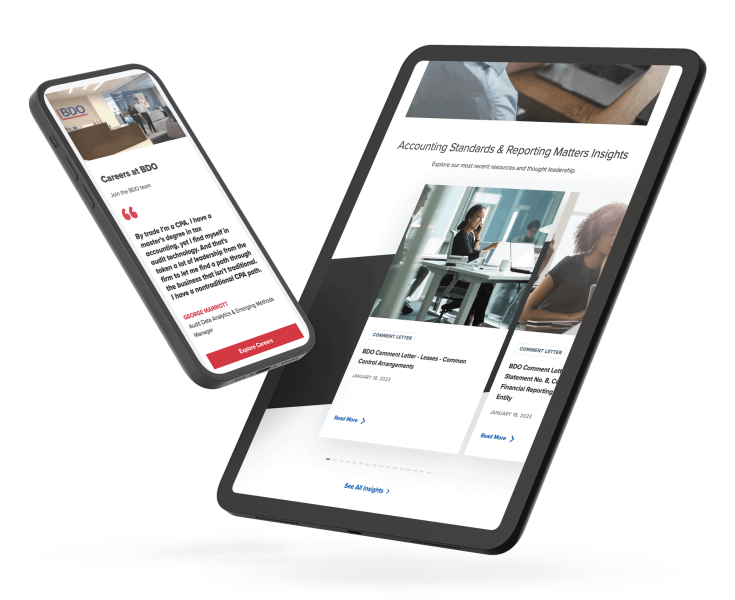
See our work for BDO USA, LLP
Take into consideration the limited size of the mobile screen and increase the font size to enhance readability and comprehension. Make sure to test your font sizes on actual devices to ensure optimal legibility and spacing.
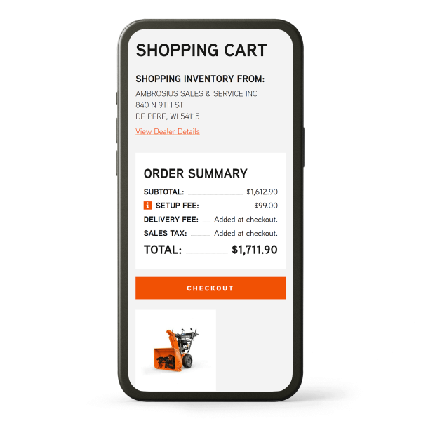
See our work for Ariens
For a website that needs to perform on desktop, tablet, and mobile platforms, ensure a seamless user experience across devices. Maintain similarity in the user interface and organize content effectively on smaller devices to provide a user-friendly, consistent experience.

See our work for Vermeer
All of these items, when planned and executed well, will make the experience of using your website on a mobile device much more pleasant and useful. Your customer comes to your website for information. The easier you can make it for them to get that information, the better.

Stay up to date on what BizStream is doing and keep in the loop on the latest in marketing & technology.